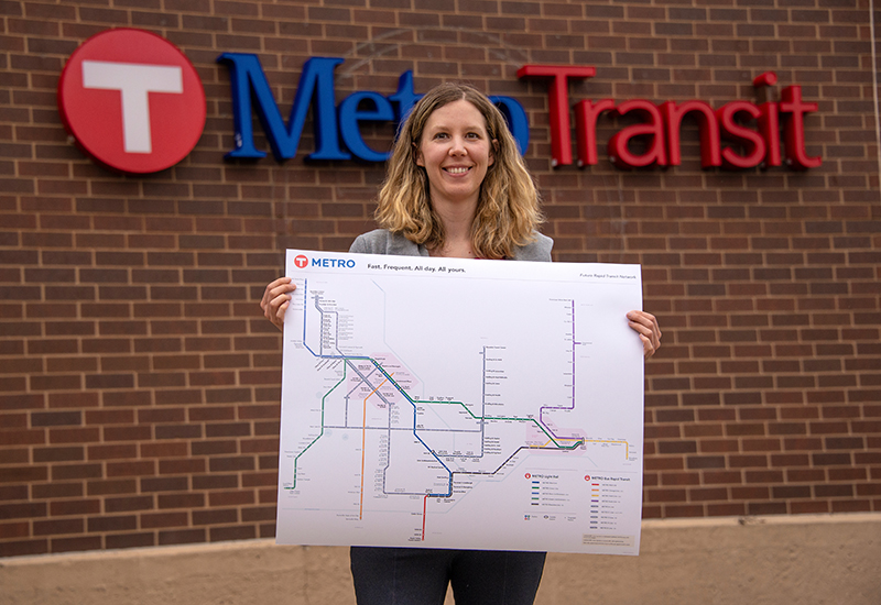
 Senior Graphic Designer Leah Janz has made a lot of maps. But none have been quite as ambitious as her latest creation, which depicts each of the current and future Light Rail Transit and Bus Rapid Transit lines that make up the METRO network.
LRT and BRT lines in the METRO network have fast, frequent, all-day service. Today’s METRO network includes the Green, Blue, A and Red lines. The network will expand in June with the opening of the C Line, which will provide BRT service between downtown Minneapolis and the Brooklyn Center Transit Center.
This week, Janz talked about how she created the latest version of the METRO map and how she hopes it will help build enthusiasm for future expansion.
How do you begin to create a map like this?
I created the first version of this map in 2012 when we were preparing for the Green Line opening. I started with a geographic map of all the METRO routes and simplified it using straight lines. Since that original version, the layout has changed to accommodate additional lines and stations. Some design elements have also changed, like using a 10-point grid, restricting the lines to 45- and 90-degree angles and new station icons. Making changes can take several hours as stations and lines are reorganized to fit new information. There’s a lot of trial and error, too. This latest version went through more than five rounds of revisions before it was finalized. Even as the map has grown, simplicity remains the most important goal.
What were the biggest challenges you faced when making this map?
Adding the future arterial BRT network within the existing network was a big challenge. Because they are identified by letters instead of colors, we used a neutral gray and letter to identify each line. Then we had to figure out how to communicate what exactly those gray lines are in the legend. To make the new lines and stations fit, a lot of the existing lines had to change. We almost didn’t include the station names because they’re long and weren’t going to fit without some major modifications. I had to make the map larger to accommodate the names, which required a lot of finessing of the lines and stations. As our system grows, I expect to do a lot more creative problem solving.
What examples did you look to when creating this map?
This map was modeled after the topological (also called diagrammatic or schematic) style created by Henry Beck for the London Underground in 1931. He believed that simplifying maps through straight lines and geography distortion made the map easier to understand. Ridership increased because customers could make faster decisions. A traditional geographic map, while physically accurate, is harder to understand. Many people don’t want to invest that time and decide not to try transit. Beck’s style was and is so successful that many other transit agencies, including us, have adopted the concept. When making this map, I also referenced maps in the book Transit Maps of the World to see how things like station iconography and transfer points have been handled elsewhere. The most recent printing of the book (2015) has my original METRO map in it, but it’s evolved a lot since then. I’ve also sought out other resources that have informed some of my decisions, including a transit map blog written by a graphic designer.
Do you have a favorite line on the map?
As a former St. Paul resident and University of Minnesota alum, I prefer the Green Line. I just wish it had opened ten years earlier so I could have used it while I was in school! The Orange Line will become a close second when it opens in a few years. I’m looking forward to riding that when I move to the south metro.
What do you hope people think when they see this map?
I hope the map communicates that the METRO network is easy to use and that it encourages more people to use transit. I also hope it helps lead to more public investment in transit so that open areas of the map are filled in and we’re able to serve more people.